42. pandas数据可视化-样式选择
pandas、python里要绘制数据需要安装matplotlib模块(包),安装命令如下:
pip install matplotlib
回车即可安装完成。
42.1 数据准备cumsum
为何更好的展示基于pandas数据的可视化,先用pandas创建一些数据,这里有三列数据,数据的索引是时间序列的数据,最后以DataFrame的形式展示出来。
import pandas as pd
import numpy as np
import matplotlib.pyplot as plt
np.random.seed(111111)
v = np.random.randn(200, 3)
print v
程序执行结果:
[[-1.87832417  1.36236745 -0.92586205]
 [ 0.06489352 -0.43757163  1.73810748]
...<中间部分省略>...
 [-0.76115458  0.02728401 -1.00391123]
 [-0.41522083  1.17074331  0.64568291]]
数据是200行、3列的的数据,可以视为二维数据。接下来创建DataFrame:
import pandas as pd
import numpy as np
import matplotlib.pyplot as plt
np.random.seed(111111)
v = np.random.randn(200, 3)
print v
ind = pd.date_range('2018-12-25', periods = 200)
df = pd.DataFrame(v, index = ind, columns = ["A", "B", "C"])
print df
这里的df用之前创建的v作为值,用ind即时间序列作为df的index,由于v变量有3列,可以通过pd.DataFrame函数的columns参数为每一列赋一个列名字即["A", "B", "C"],第一列列名字为"A"。
                   A         B         C
2018-12-25 -1.878324  1.362367 -0.925862
2018-12-26  0.064894 -0.437572  1.738107
...<中间部分省略>...
2019-07-11 -0.761155  0.027284 -1.003911
2019-07-12 -0.415221  1.170743  0.645683
如果就用df去绘制数据可视化,结果不太好看,可以对df这个DataFrame数据进行汇总,例如cumsum,这个函数的作用是某已存在的DataFrame前n项数据作为生成DataFrame的第n项值。
import pandas as pd
t = pd.Series(range(10))
print t
tn = t.cumsum()
print tn
程序执行结果:
0    0
1    1
2    2
3    3
4    4
5    5
6    6
7    7
8    8
9    9
dtype: int64
0     0
1     1
2     3
3     6
4    10
5    15
6    21
7    28
8    36
9    45
dtype: int64
对df进行cumsum处理,得到如下的程序:
import pandas as pd
import numpy as np
import matplotlib.pyplot as plt
np.random.seed(111111)
v = np.random.randn(200, 3)
#print v
ind = pd.date_range('2018-12-25', periods = 200)
df = pd.DataFrame(v, index = ind, columns = ["A", "B", "C"])
#print df
dfc = df.cumsum()
print dfc
程序的执行结果:
                    A          B          C
2018-12-25  -1.878324   1.362367  -0.925862
2018-12-26  -1.813431   0.924796   0.812245
...<中间部分省略>...
2019-07-11 -23.070763  11.341135   8.555557
2019-07-12 -23.485984  12.511878   9.201240
42.2 数据可视化的样式
数据准备好了,就可以绘制数据的可视化图像了,参考前一章调研plot函数即可完成。
import pandas as pd
import numpy as np
import matplotlib.pyplot as plt
np.random.seed(111111)
v = np.random.randn(200, 3)
#print v
ind = pd.date_range('2018-12-25', periods = 200)
df = pd.DataFrame(v, index = ind, columns = ["A", "B", "C"])
#print df

dfc = df.cumsum()
print dfc
dfc.plot()
plt.show()
程序执行结果:
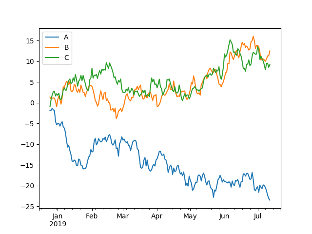
这是默认的绘制可视化数据的样式,基本能够满足要求,有的时候可能适度调整或修饰一下,例如图上一般有个对全图的说明文字、x轴、y轴没有标准是什么....。
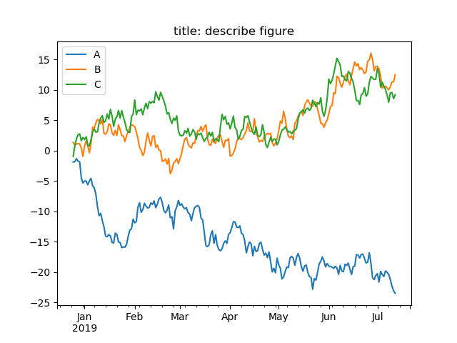
- 给图加title即描述图的文字,可以在plot函数里通过title参数设定。
import pandas as pd
import numpy as np
import matplotlib.pyplot as plt
np.random.seed(111111)
v = np.random.randn(200, 3)
#print v
ind = pd.date_range('2018-12-25', periods = 200)
df = pd.DataFrame(v, index = ind, columns = ["A", "B", "C"])
#print df
dfc = df.cumsum()
#print dfc
dfc.plot(title = "title: describe figure")
plt.show()
程序执行j结果:
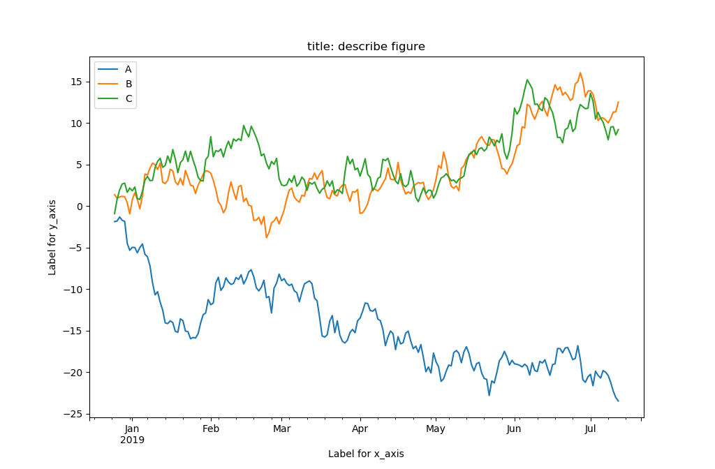
- 给坐标轴加描述性文字,可以使用xlabel、ylabel函数。
import pandas as pd
import numpy as np
import matplotlib.pyplot as plt
np.random.seed(111111)
v = np.random.randn(200, 3)
#print v
ind = pd.date_range('2018-12-25', periods = 200)
df = pd.DataFrame(v, index = ind, columns = ["A", "B", "C"])
#print df
dfc = df.cumsum()
#print dfc
dfc.plot(title = "title: describe figure")
plt.xlabel("Label for x_axis")
plt.ylabel("Label for y_axis")
plt.show()
程序执行结果:
- 修改线的标注文字可以对plot对象调用legend函数来修改。
import pandas as pd
import numpy as np
import matplotlib.pyplot as plt
np.random.seed(111111)
v = np.random.randn(200, 3)
#print v
ind = pd.date_range('2018-12-25', periods = 200)
df = pd.DataFrame(v, index = ind, columns = ["A", "B", "C"])
#print df
dfc = df.cumsum()
#print dfc
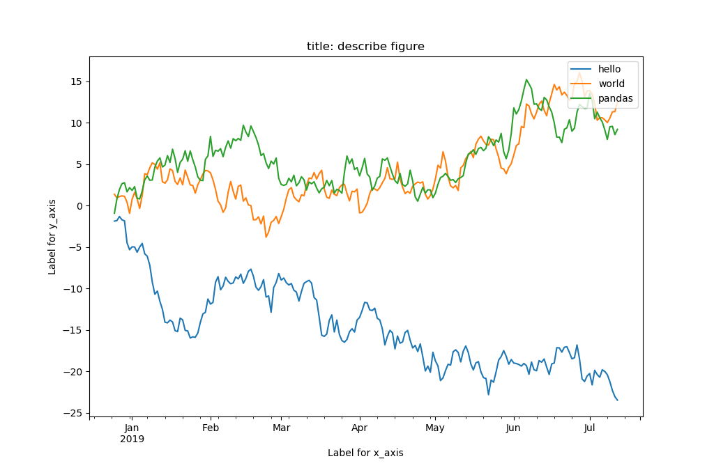
ax = dfc.plot(title = "title: describe figure")
plt.xlabel("Label for x_axis")
plt.ylabel("Label for y_axis")
ax.legend(["hello", "world", "pandas"])
plt.show()
程序执行结果如下图:
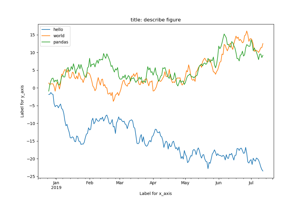
原来是直接用DataFrame变量df的columns的值作为每条绘制曲线的标注文字,这里用了legend函数修改了左上角对每条绘制曲线的文字标注。请注意,图上线的标注文字默认是放置在左上角的,可以在legend函数通过loc参数调整成其他位置。
import pandas as pd
import numpy as np
import matplotlib.pyplot as plt
np.random.seed(111111)
v = np.random.randn(200, 3)
#print v
ind = pd.date_range('2018-12-25', periods = 200)
df = pd.DataFrame(v, index = ind, columns = ["A", "B", "C"])
#print df
dfc = df.cumsum()
#print dfc
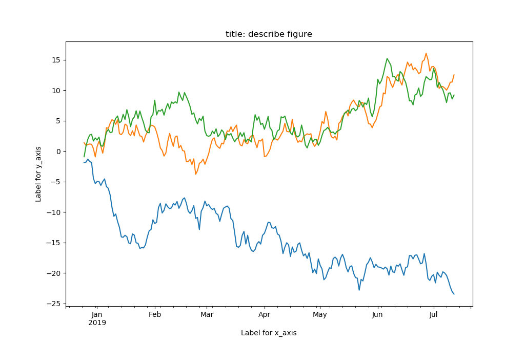
ax = dfc.plot(title = "title: describe figure")
plt.xlabel("Label for x_axis")
plt.ylabel("Label for y_axis")
ax.legend(["hello", "world", "pandas"], loc = "upper right")
plt.show()
程序执行结果:
对线的标注文字调整到了右上角。更多的位置设置参考下表:
| Location String | Location Code |
|---|---|
| ‘best’ | 0 |
| ‘upper right’ | 1 |
| ‘upper left’ | 2 |
| ‘lower left’ | 3 |
| ‘lower right’ | 4 |
| ‘right’ | 5 |
| ‘center left’ | 6 |
| ‘center right’ | 7 |
| ‘lower center’ | 8 |
| ‘upper center’ | 9 |
| ‘center’ | 10 |
- 关闭图上线的标注,可以在plot函数里通过legend参数设置为False即可。
import pandas as pd
import numpy as np
import matplotlib.pyplot as plt
np.random.seed(111111)
v = np.random.randn(200, 3)
#print v
ind = pd.date_range('2018-12-25', periods = 200)
df = pd.DataFrame(v, index = ind, columns = ["A", "B", "C"])
#print df
dfc = df.cumsum()
#print dfc
ax = dfc.plot(title = "title: describe figure", legend = False)
plt.xlabel("Label for x_axis")
plt.ylabel("Label for y_axis")
#ax.legend(["hello", "world", "pandas"], loc = "upper right")
plt.show()
程序执行结果:
上图没有了对线的标注文字,是通过语句ax = dfc.plot(title = "title: describe figure", legend = False)设置legend参数为False实现的。
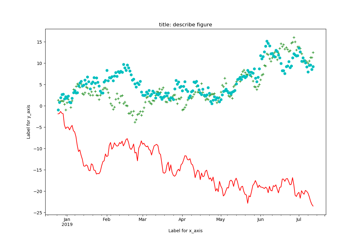
- 可视化图形线的修改,可以选择线的形状和颜色。线型的选择类型有:
| character | description |
|---|---|
'-' |
solid line style |
'--' |
dashed line style |
'-.' |
dash-dot line style |
':' |
dotted line style |
'.' |
point marker |
',' |
pixel marker |
'o' |
circle marker |
'v' |
triangle_down marker |
'^' |
triangle_up marker |
'<' |
triangle_left marker |
'>' |
triangle_right marker |
'1' |
tri_down marker |
'2' |
tri_up marker |
'3' |
tri_left marker |
'4' |
tri_right marker |
's' |
square marker |
'p' |
pentagon marker |
'*' |
star marker |
'h' |
hexagon1 marker |
'H' |
hexagon2 marker |
'+' |
plus marker |
'x' |
x marker |
'D' |
diamond marker |
'd' |
thin_diamond marker |
'|' |
vline marker |
'_' |
hline marker |
而线的颜色选择有:
| character | color |
|---|---|
| ‘b’ | blue |
| ‘g’ | green |
| ‘r’ | red |
| ‘c’ | cyan |
| ‘m’ | magenta |
| ‘y’ | yellow |
| ‘k’ | black |
| ‘w’ | white |
两者可以组合,例如r-表示红色实线。可以通过plot函数的style形参给出线的样式。
import pandas as pd
import numpy as np
import matplotlib.pyplot as plt
np.random.seed(111111)
v = np.random.randn(200, 3)
#print v
ind = pd.date_range('2018-12-25', periods = 200)
df = pd.DataFrame(v, index = ind, columns = ["A", "B", "C"])
#print df
dfc = df.cumsum()
#print dfc
ax = dfc.plot(title = "title: describe figure", legend = False, style = ["r-", "g+", "ch"])
plt.xlabel("Label for x_axis")
plt.ylabel("Label for y_axis")
#ax.legend(["hello", "world", "pandas"], loc = "upper right")
plt.show()
程序执行结果:
- 缩短绘制的区间,可以使用DataFrame的loc操作获得。
import pandas as pd
import numpy as np
import matplotlib.pyplot as plt
np.random.seed(111111)
v = np.random.randn(200, 3)
ind = pd.date_range('2018-12-25', periods = 200)
df = pd.DataFrame(v, index = ind, columns = ["A", "B", "C"])
dfc = df.cumsum()
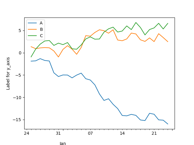
dfc.loc['2018-12-25':'2019-01-24'].plot()
plt.xlabel("Label for x_axis")
plt.ylabel("Label for y_axis")
plt.show()
请注意代码dfc.loc['2018-12-25':'2019-01-24'].plot()得到的结果:
本章就用matplotlib绘制可视化图像内容做了简要的介绍与基本使用。更多可视化绘制图像的内容可以后续继续学习matplotlib模块包。
感谢Klang(金浪)智能数据看板klang.org.cn鼎力支持!